|
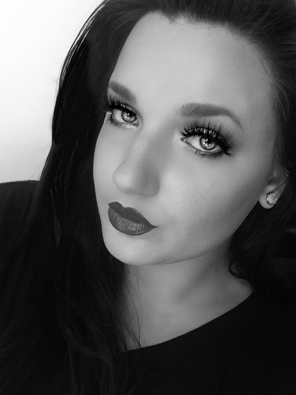
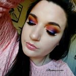
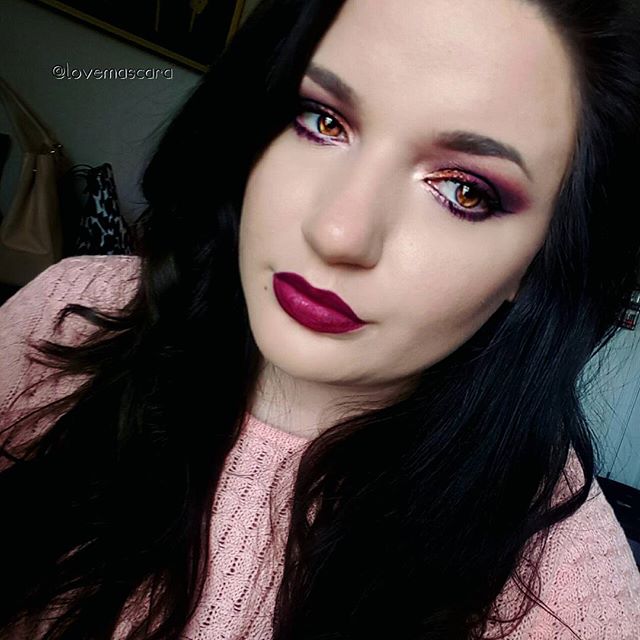
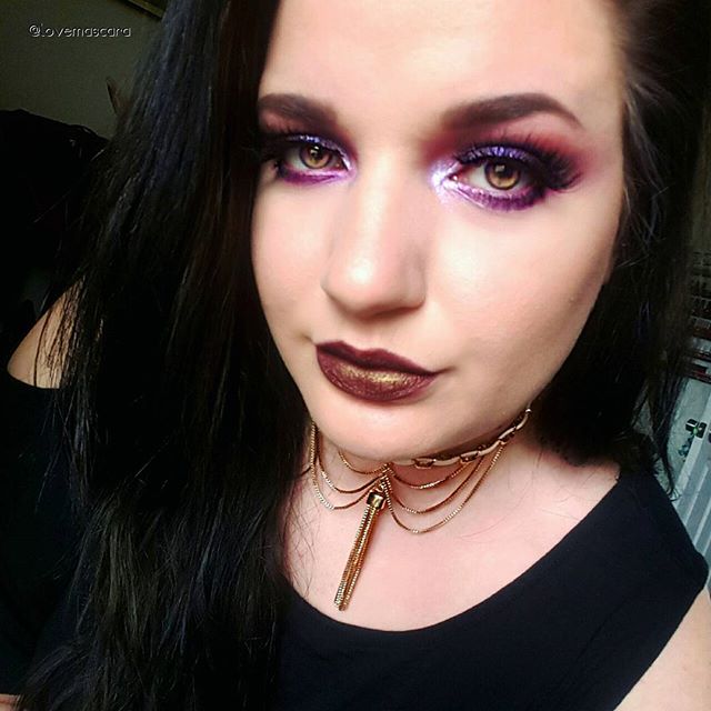
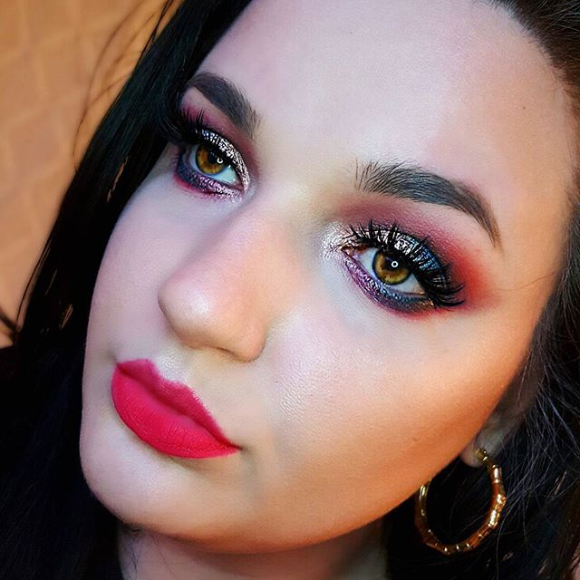
Several months back I done a blog post about concealers, "The Good, The Bad, and The Eh". I didn't think much about the title until I was looking at recent eye palettes that I'd gotten, because it seems like every brand launches the same thing all at once. Right now it's lip palettes. You see what I'm saying. So like I said I was looking at recent eye palette purchases and thinking that some were good, some were crap, and some were just okay. So I thought why not do another "The Good, The Bad and The Eh", but this time for eye palettes. Let's start good and we'll end with bad. 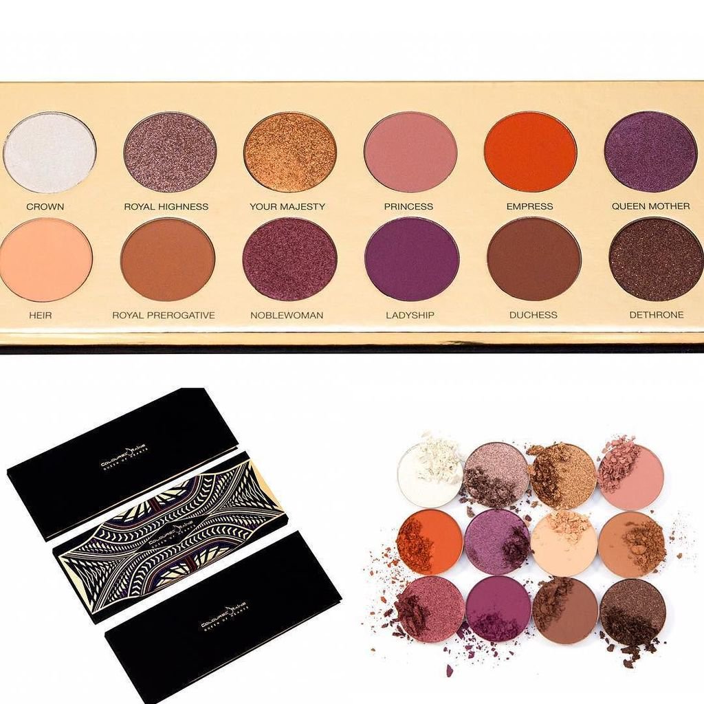 *the picture above is from Coloured Raine's twitter* First up is the Queen of Hearts palette by Coloured Raine. I'm sure this is sold out by the time this goes up and I hope they restock because everyone needs this palette. If you love red berry, orange, and foiled shadows you will love this palette. It's quite a big palette too in size. The shadows are lovely. I wasn't going to get it because it was the same color scheme or similar to ABH Modern Renaissance but the foiled shadows are what got me. "Ladyship" feels a bit rough texture wise but it works great with a brush so I don't hold that against it. This doesn't really have any matte brow bone highlight shades so bear that in mind and it doesn't have a black shade either. It has a beautiful shimmer ivory highlight with a touch of duo chrome to it which actually looks great as a cheekbone highlight as well. I really can't say much else, this speaks for itself. Each shade you seen is as intense on the eye as it is in the pan. 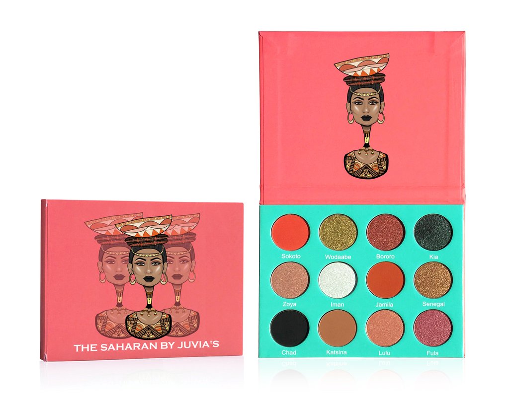 *the picture above is from Juvia's Place website* Next is Juvias Place The Saharan Palette. This just recently released. It's absolutely gorgeous and unique. Juvia's Place is super affordable. All their palettes have consistent, super pigmented formulas. This is no different. It's a bit out of the ordinary. You can look at some of the shades and wonder why they're even in there because it looks like the color scheme wouldn't flow together. That's why I love it though. You get shades you don't normally see. A healthy mix of super pigmented mattes and foiled type shadows and two shimmers. You can do a lot of cool looks with this. It has the blackest black I've ever seen in my life and a really nice tan transition shade. Once again no matte highlight but you do have a shimmer one. There are some super bold matte shades that are so fun to use in the crease and the foiled shades are awesome as always. You get 12 shades all together and I believe it's around $30. You need at least one of their palettes in your life because they are amazing. Also, there is always codes out there to save you at least 10%. I used "Trendmood" for mine. Moving onto the Eh. 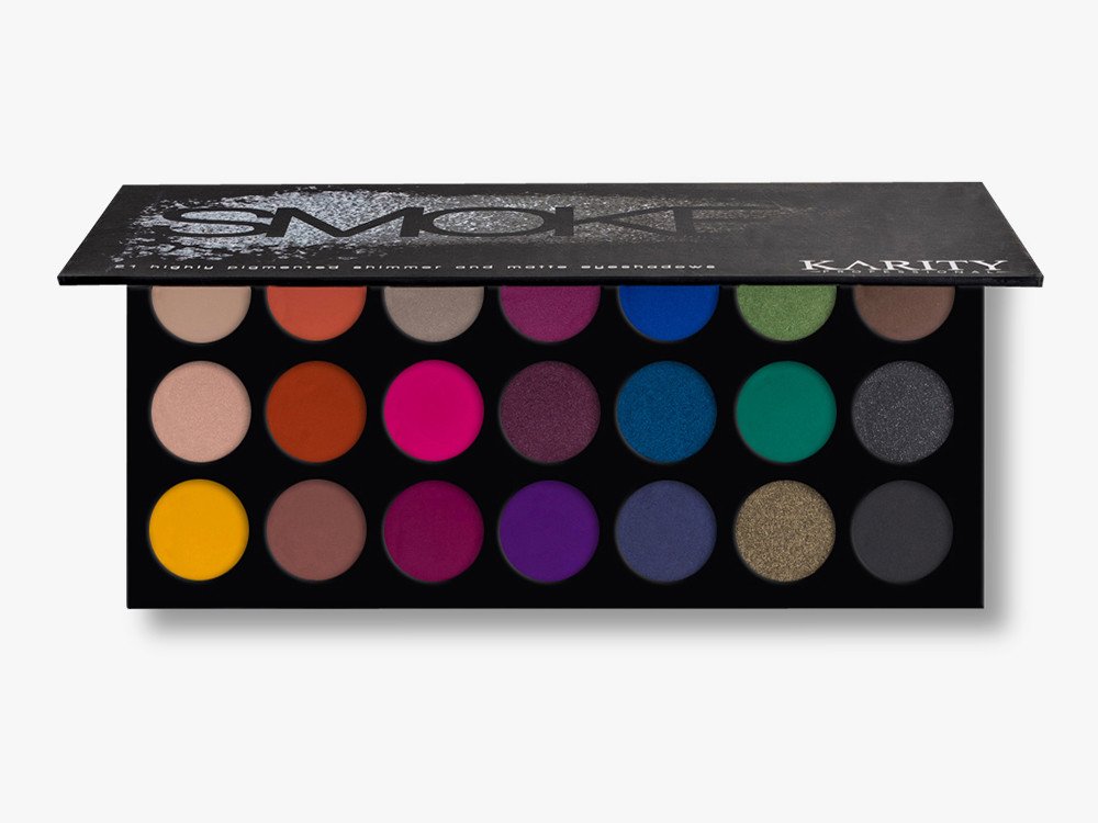 *The picture above is from the Karity website* The Karity Smokey palette is in the "Eh" category for me. I believe it's because it was super hyped by ads and so on, it just pulled me in. Don't get me wrong it's not a bad palette it's just not as great as everyone says it is, if I'm being honest. It has some in consistencies and I've seen better. It's as simple as that, I've seen better. Overall you get 21 shadows for $28.50 (pretty sure you can get $10 off as well), and out of those 21 shadows a lot of them are okay and can be worked with. Some however just aren't. So like I said it's not terrible, it's just not great. 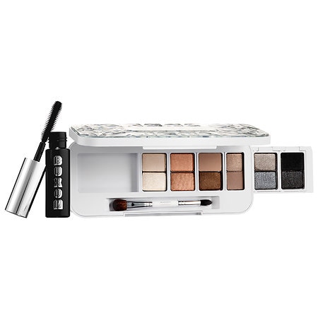 *The picture above is from Sephora.com* Buxom Stone Cold palette from the Stone Cold Babe set, which is now in the Sale section in Sephora and Ulta, is another palette that's ok but not great. First, mine came damaged so lets get that out of the way. However, once pieced back together I find that most of the shades don't really create a good dimensional look, it just all becomes one color. I don't like that. If I'm going to put in the work for a crease shade and shimmer on my lid and darken up my outer corner, I don't want it to all just melt together into one taupe type shade. The colors in these are so similar that it's very hard to create different looks with this, they'll just about always look the same. Which again is something I don't care for. However, the formula is not bad it performs well and blends nice (obviously) so I just don't like the layout or colors chosen for this palette. I don't mind the theme, I just wish there was several shade ranges in the palette even if they stay with the same color scheme. It looks like there is online in the picture but in person and certainly when using it you see that the shades are very similar to each other. 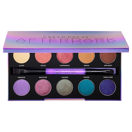 *The picture above is from Sephora.com* Now to the bad. I hate to do this. I really do. I love Urban Decay but the AfterDark palette is just a fail for me. It looks gorgeous and if you have the time you can make it work but I find the shades hard not creamy which makes them difficult to work or build up. Some shades just don't seem to build up much at all. I do have a favorite color in there which is Fringe, these are all very bold shimmery shades. They're meant to be intense I think and have some duo chrome to a few but it's just not there for me. I don't like it, I wouldn't recommend it. There's my thoughts. This is even sold out online on Sephora, so maybe I'm the only one who doesn't like it but I just don't care for it. I'm going to include some looks below that I've used each palette with. So you can at least see them on the eyes and how they look over all blended out and so on. 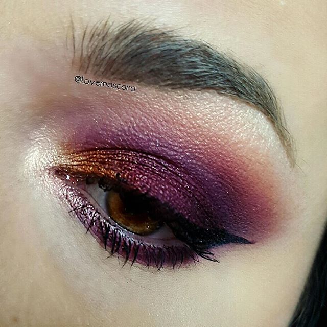 This look is from the Queen of Hearts palette. It's bold, it's intense, it's dark but still burgundy. It has a pop of warmth in it and I live for that inner corner highlight. I'm not even wearing lashes in this picture which I'm super impressed by. 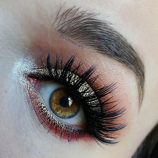 This look is from the Saharan Palette. It actually had such a different look in person and was not captured that way in the picture but none the less this photo and the one below will hopefully show how diverse you can get with your looks, with this palette. 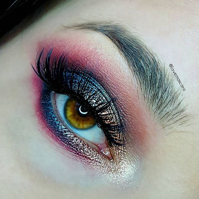 This look is Saharan Palette in the crease and some on the lid but the teal blue shade is Fringe from the AfterDark palette which is my favorite shade form that palette. 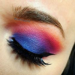 This look was using the Karity palette. As you can see it built up well. I used the shades that were good in the palette and stayed away from the ones that didn't have much pigment. I did have to work with this a bit longer than other palettes or shadows, especially the blue. It's not my favorite look to be honest but it's the only one I have. 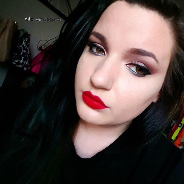 This look I was using the Buxom Stone Cold Babe palette. As you can see it's just a very basic eye look. It's doesn't draw attention and it's very subtle. Which isn't always a bad thing which is why I'm gonna keep it around but I like for my eye looks to have some kind of "pop" to them most of the time. 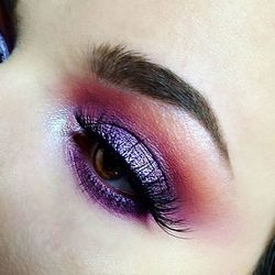 This is using the purple shades in the AfterDark palette from Urban Decay. I had to dip my brush in Mehron Mixing Liquid to get the intensity you see in the pan. Like I said it's just hard to work with. You can make them work if you put in the time but other shadows are easier and less expensive. The pics below are more shots of looks with the palettes. I didn't have any more for the Stone Cold Babe palette so it's not in the gallery below.
2 Comments
SocietyFix
2/11/2017 12:06:34 am
Love the shade of the first Palette.
Erin K Simmons
2/19/2017 05:35:40 pm
thank you! and sure I will follow you! I'm not on there much but I'll gladly go follow you. :) Your comment will be posted after it is approved.
Leave a Reply. |
ErinI'm from Tennessee. I'm a makeup and skincare lover. I have always enjoyed creating looks but I love to help people with product knowledge and application even more. I've been able to start blogging and do these things I love because God has seen fit to bless me with the opportunity. Thanks for stopping by and visiting with me! 

 
Categories
All
Archives
January 2022
|

 RSS Feed